Global Human Resources (HR) Portal
UX Design Lead & Web Development
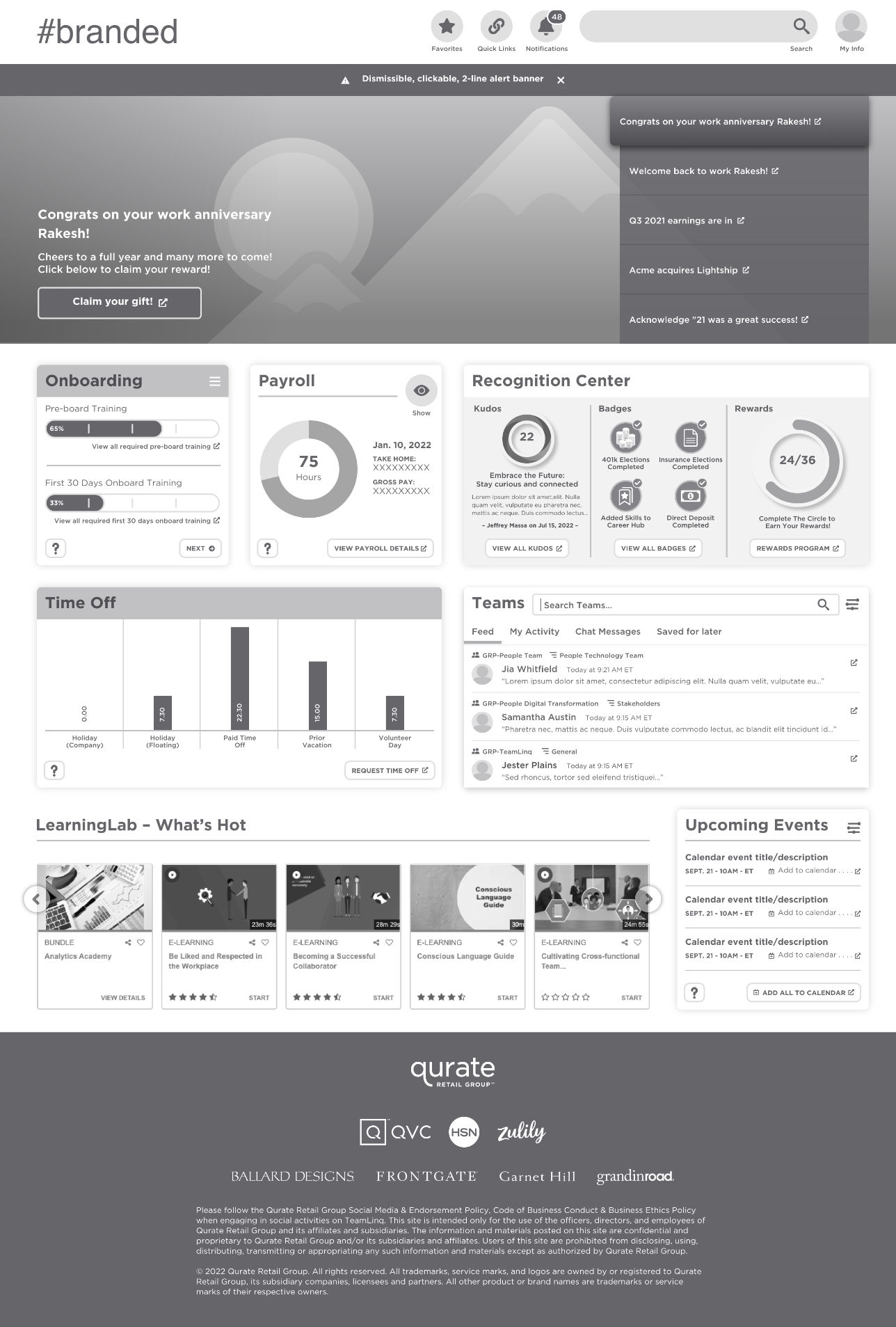
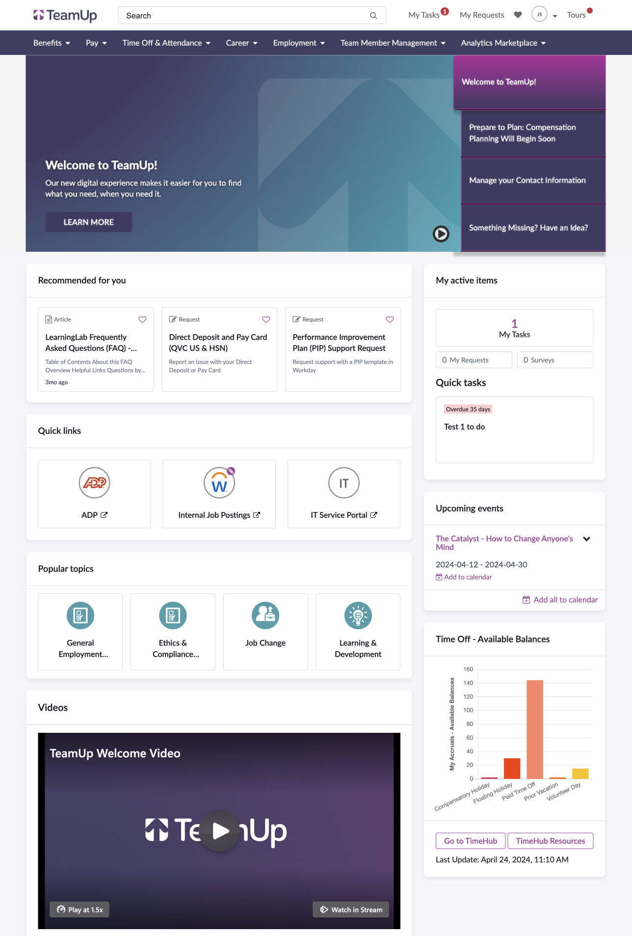
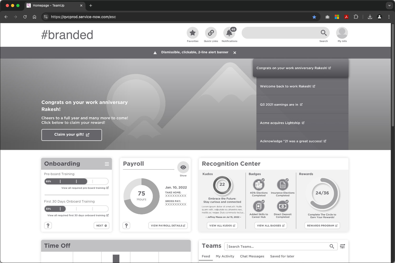
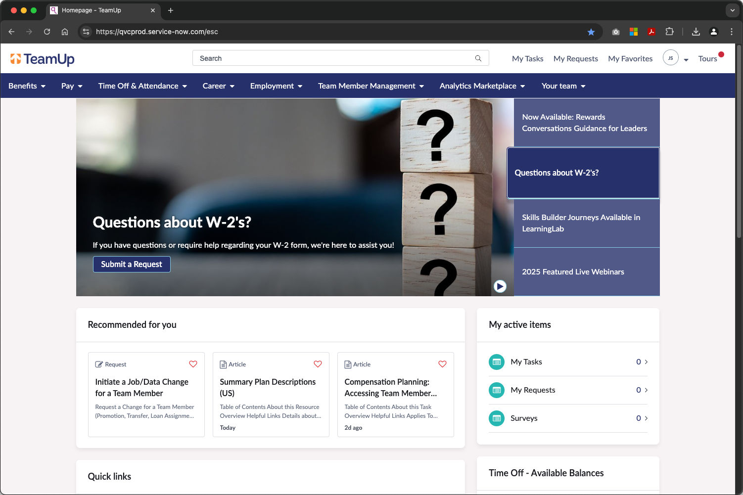
We designed this new portal to be the single entry point for all Team Members across the globe. Our team brought together multiple systems through integrations and deep links and provided a clearly defined connection to the People Team (HR). The new portal helps Team Members access the information and tools they need to perform their jobs more effectively.
Making HR simple: Why one entry point matters.
Team Member interviews identified several pain points (mainly centered around difficulty locating tools needed for everyday tasks), such as updating personal information, scheduling time off, or viewing shifts. These challenges largely stemmed from the reliance on multiple, disconnected systems and the lack of a centralized platform to guide users to the appropriate tools. This portal aimed to solve those issues by displaying personalized data from other applications (through integrations), and providing deep links to those systems for end users to action on that data (i.e. update their home address).
- Connect the HR experience across disconnected systems.
- Provide access to commonly used tools in one place.
- Display personal information with deep links to edit that information.
Prototyping and testing.
To design the new system (built on ServiceNow’s Employee Center Pro) I created interactive prototypes with Adobe XD. These clickable designs were tested with Team Members, allowing us to gather direct feedback on how they preferred to view and interact with their information. This user-centered approach helped us refine the layout, content hierarchy, and overall experience to meet and exceed their needs.
- Design interactive prototypes for Team Member feedback.
- Incorporate feedback and iterate based on end user preferences.
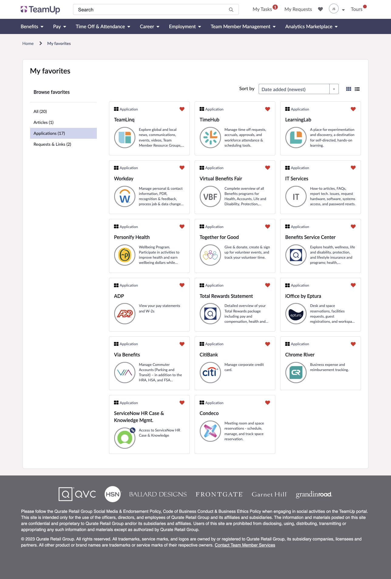
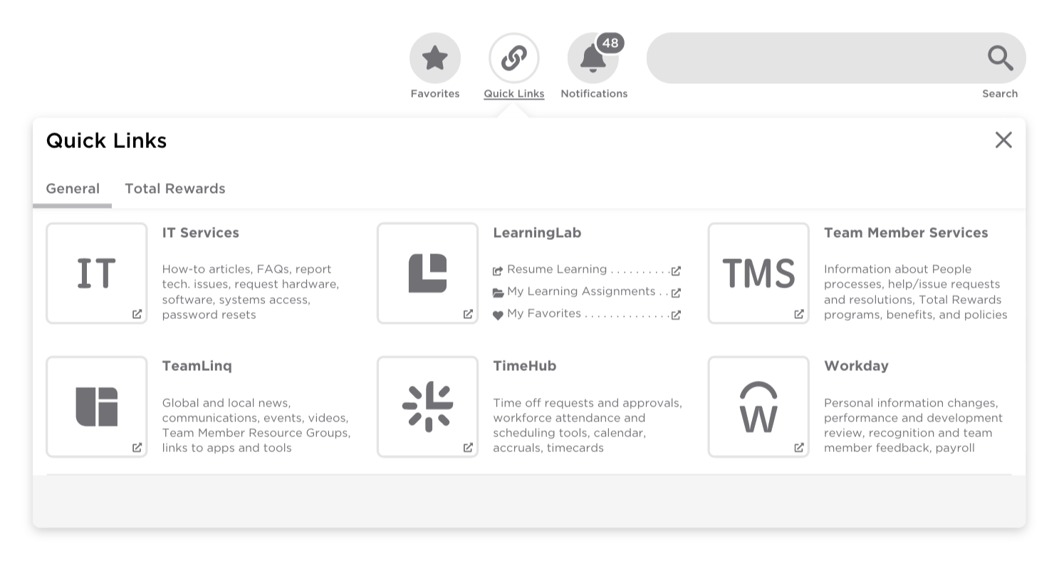
Iterating external applications with feedback.
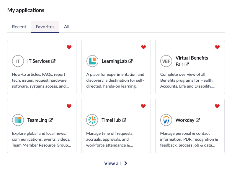
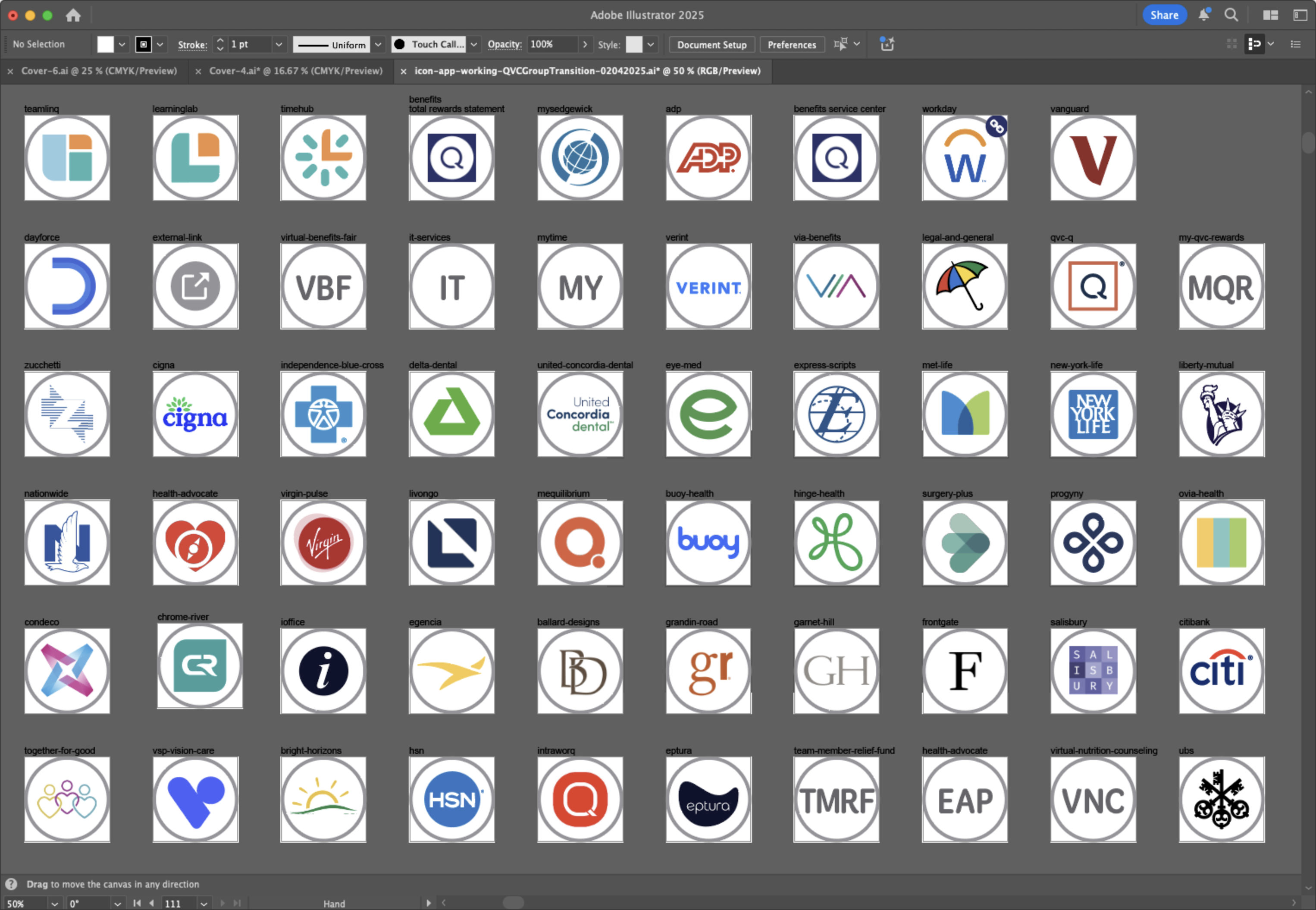
Based on our Team Members’ feedback, we transitioned from the previous dropdown-driven navigation to a dedicated page for external applications. This shift allowed us to leverage out-of-the-box (OOTB) components provided by ServiceNow (such as filtering and sorting) to deliver a more user-friendly experience. Each application could now be displayed with its individual logo, platform name, and full description to help Team Members better understand the purpose and personal value of each tool.
- Transition UI elements from drop-down to dedicated page.
- Rely on OOTB components and reduce technical debt.
- Communicate the purpose and value of external applications.
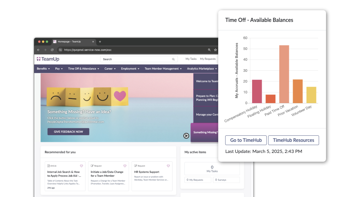
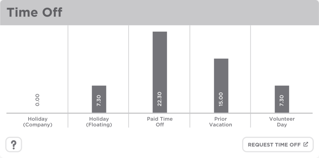
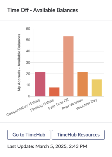
Validating usability and usefulness of the time off component.
One of the most requested and highly praised elements of the prototype was the time off component. Team Members advocated for this feature, and confirmed through testing that our solution met their needs. We then worked with a ServiceNow implementation partner to develop a custom widget. This widget pulled time-off data via the UKG/Kronos integration spoke in ServiceNow and rendered it visually with Chart.js, along with delivering an accessible, visually hidden data table. The component also provided direct links to the system of record (UKG/Kronos) for requesting time off and viewing upcoming scheduled shifts. Additionally, users could access related help articles and time-off policies directly within the ServiceNow platform.
- Validated the usefulness of a new time off component.
- Custom widget with an integration to UKG/Kronos.
- Displayed time visually (Chart.js) and accessibly (visually hidden table data).
- Enabled users to view schedules, request time off, and access help articles and policies.
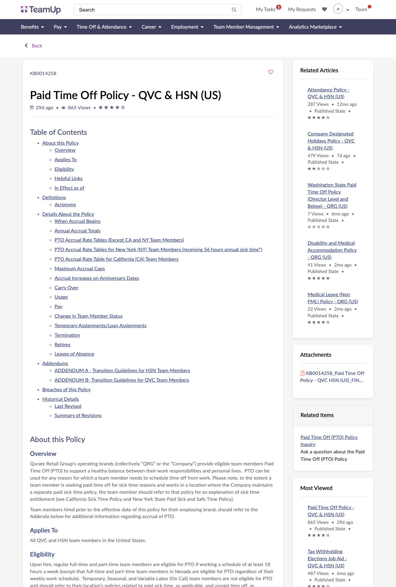
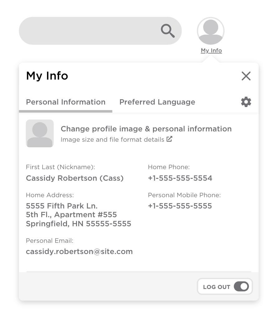
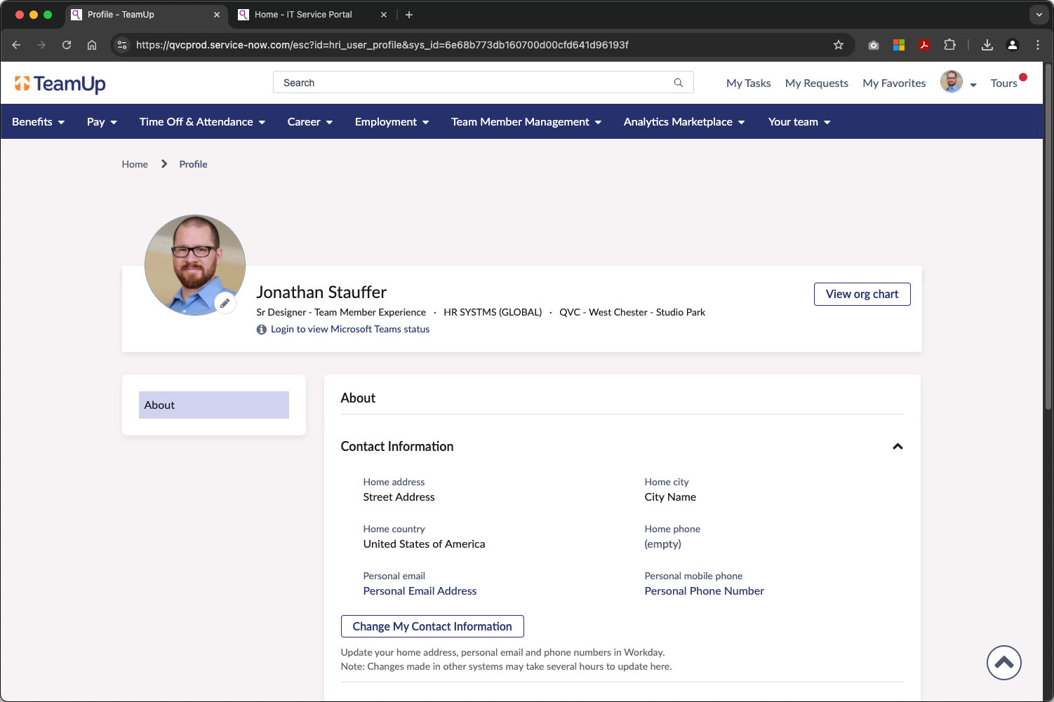
Displaying Personal Information (PI).
In the previous ServiceNow Service Portal, most key PI was not displayed as it was housed exclusively in the system of record, Workday. To improve the user experience, we extended the existing Workday integration to bring the relevant PI into the new Employee Center Pro portal. This allowed Team Members to easily validate their information, especially during critical times like tax season. For the first time, users were given a deep link to directly access the appropriate section in Workday to update their information, and upon return to the portal see the changes reflected. This streamlined the process significantly, and reduced the steps required for users to review and update their records.
- Extended Workday integration.
- Enabled Team Members to validate PI.
- Added deep links to Workday.
- Reduced process friction to update Personal Information.
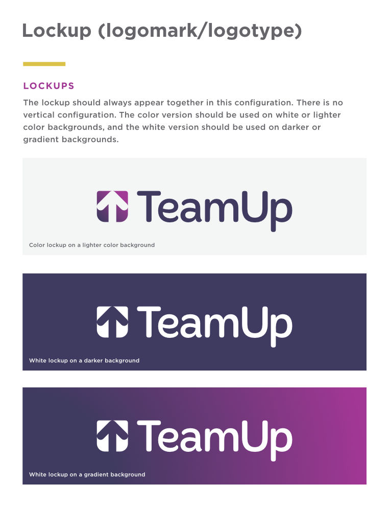
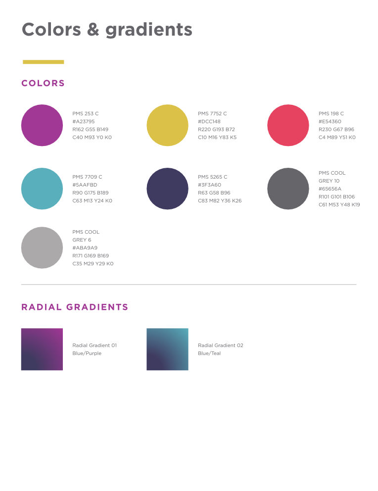
Branding the system.
In collaboration with the corporate brand team, I helped develop unique branding to differentiate the new system from other internal platforms. This allowed it to stand as the single entry point for HR services. I then created a style guide to ensure consistency across launch and support materials including, pull-up banners, digital signage, intranet articles, and email communications. The guide also served as a resource for content contributors, helping them align new articles and policies with the identity of the system.
- Partnership with the corporate branding team.
- Style guide to ensure consistency for launch, and for on-going content contributor activities.
Quantifying the success.
The success of the single entry point for HR was driven by strong Team Member adoption. The new portal achieved a 23% year-over-year case deflection rate by surfacing relevant, personalized information and offering direct ways to act on that data. This empowered Team Members to self-serve more HR needs quickly, and significantly reduced caseloads for Tier 1 HR support.
- Drove 23% year-over-year case deflection rate.
- Empowered Team Members to self-serve HR more services.
- Increased portal engagement by centralizing apps, tools, and data.